Page elements are the building blocks of your page. You need to add them to your page and manage the content within them to create your website or candidate journeys for your campaigns. On this page, we have highlighted 3 different page elements that together form the larger story:
The page elements used in the order of appearance:
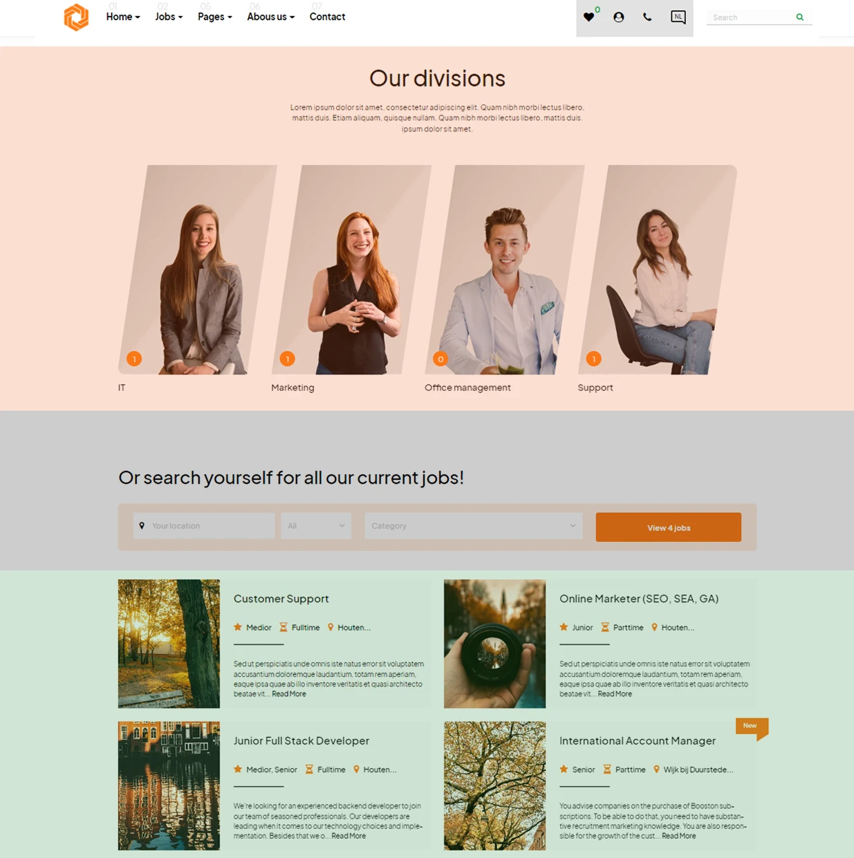
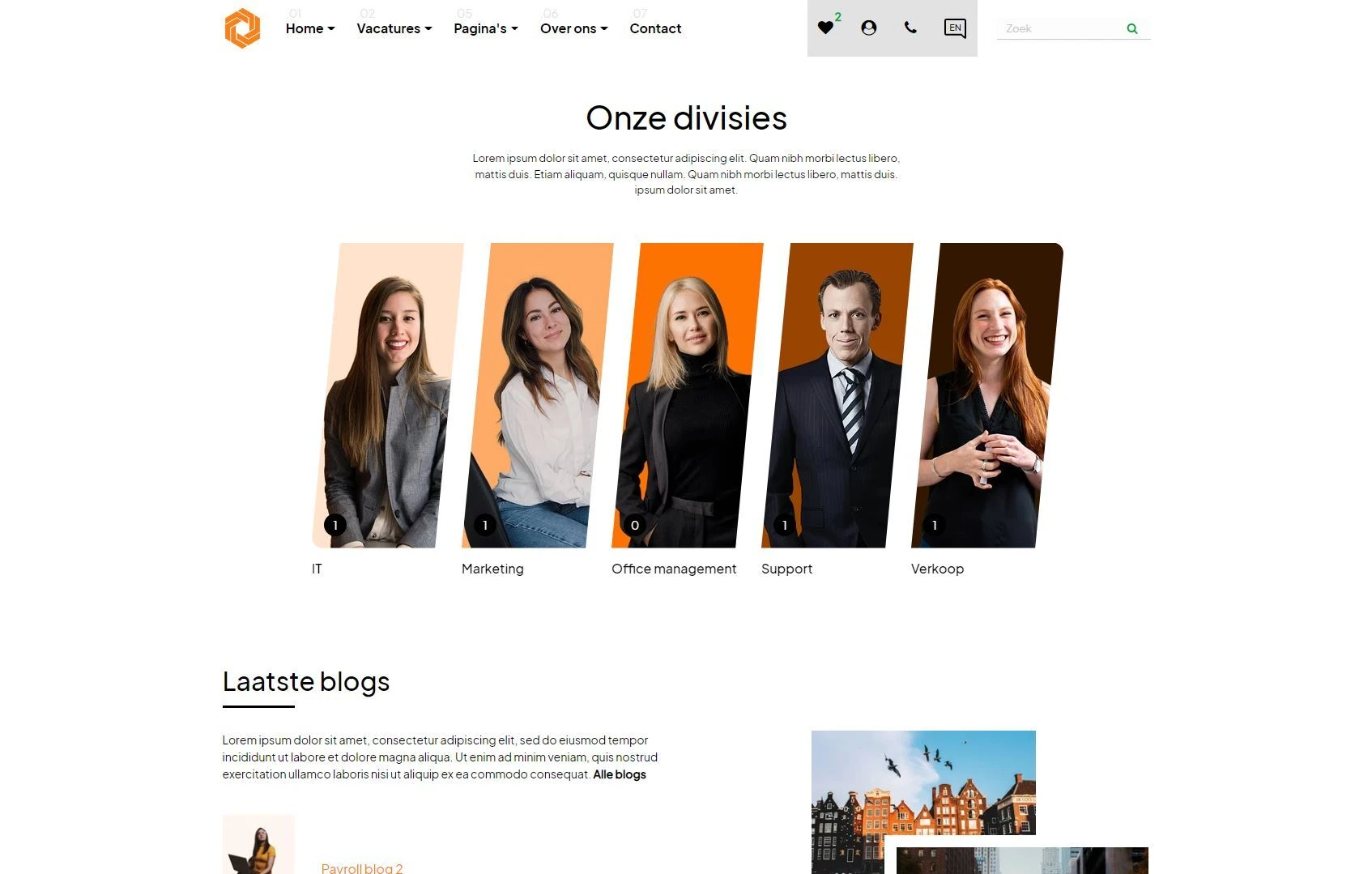
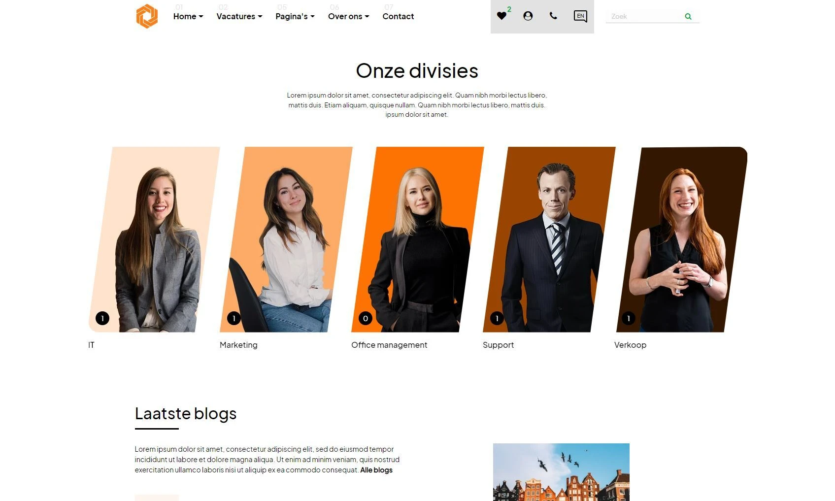
- Category overview 1 page element (highlighted in orange)
- Simple job search form (highlighted in gray)
- Job listing page element (highlighted in green)
In this article, we show you how to create, design, and manage these page elements so you can set up your pages.
Contents
- Creating a page element
- Setting up a page element: content tab
- Setting up a page element: design tab
- Setting up a page element: settings tab
- Managing page elements
- Conclusion
Setting up a page element: content tab
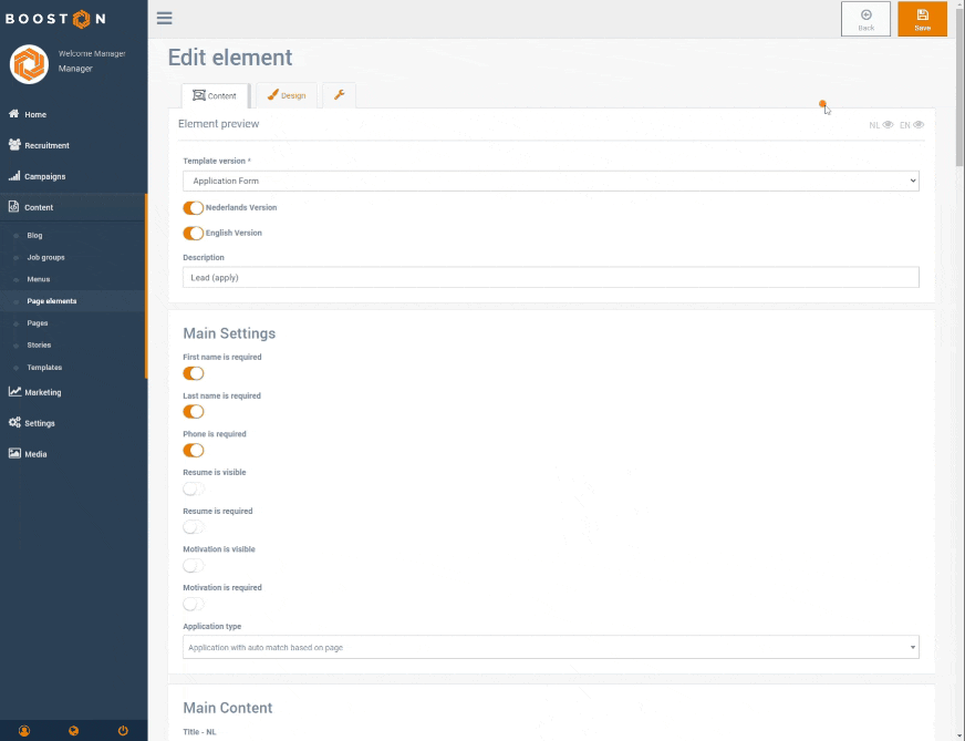
Each page element consists of 3 tabs: a content tab, a design tab, and a settings tab.
The content tab can consist of the following sections: The first section contains the general settings of the page element, such as the template used, the languages, and the name (description) of the page element. Note that this section also includes an 'eye' icon for each language, allowing you to preview it:
The following sections are optional, which means not every page element uses them.
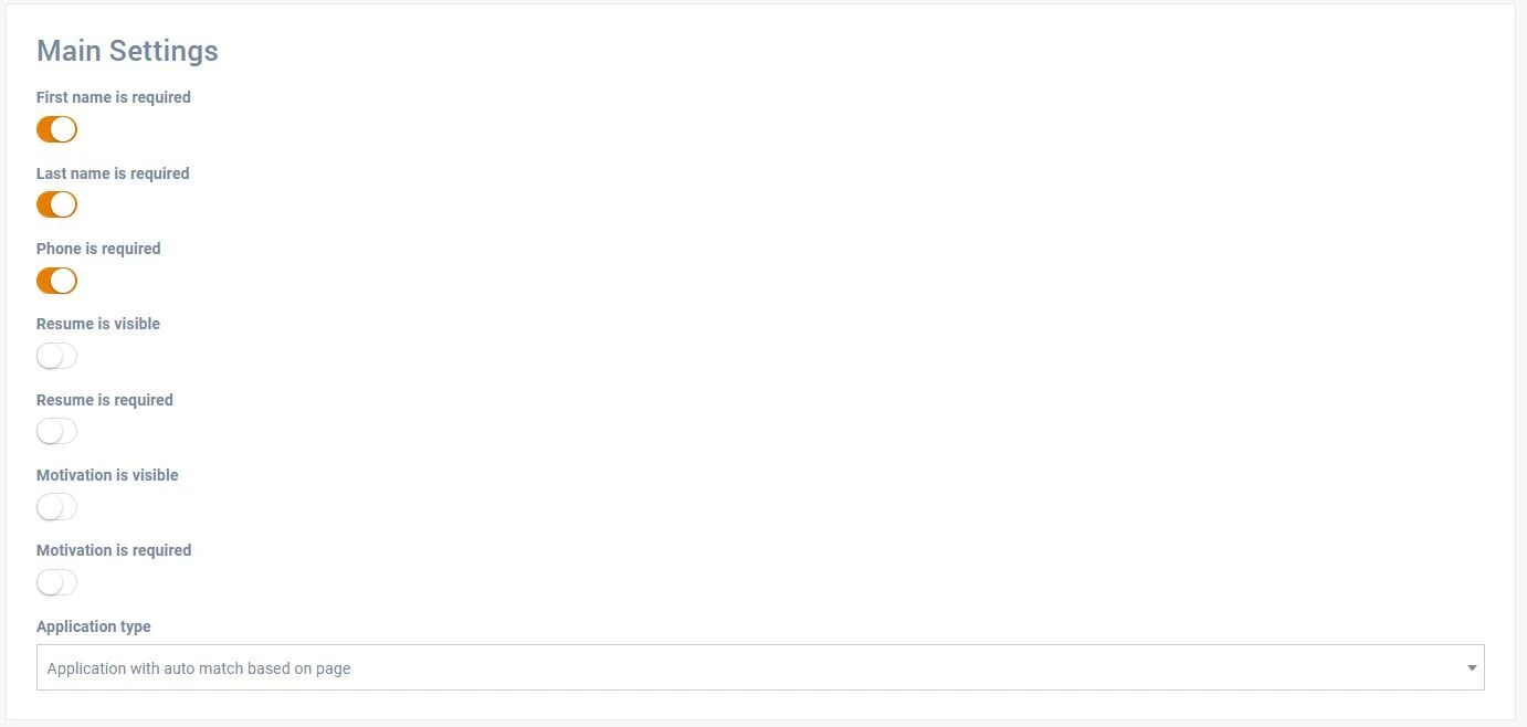
The first optional section is 'General Settings'. This is used to configure the general settings of your page element. In this example, it is an application form. Here, you can, for example, set which job the form should be linked to. These settings apply to all languages.
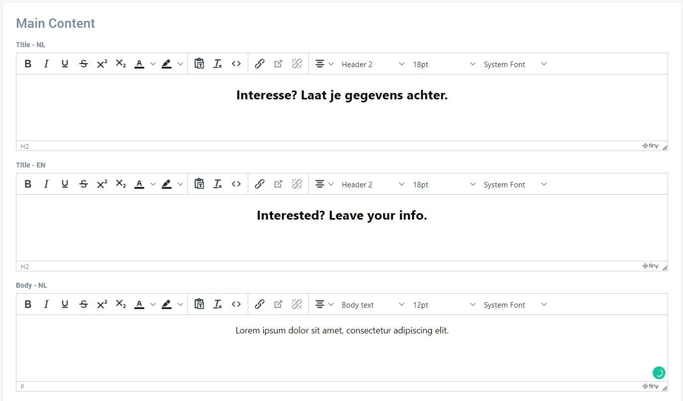
The second optional section is 'Main Content'. This ranges from images to text editors that allow you to add custom content. The content in this section can be set per language.
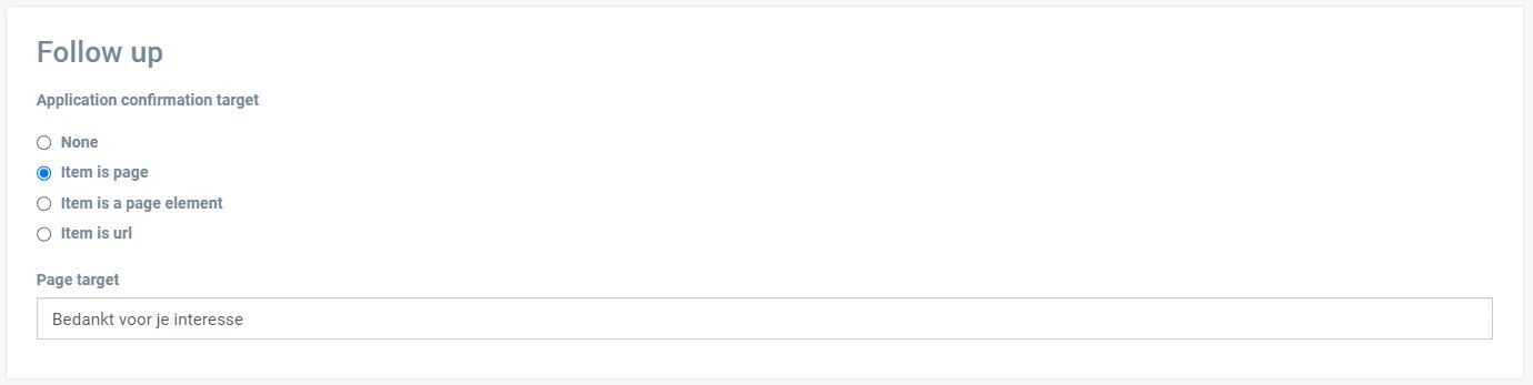
The third section is 'Follow-up'. Here, you set follow-up actions, such as redirecting to another page, a different page element, or a custom URL (e.g., an external website).
Finally, the sections 'Element Usage' and 'Usage with Custom Content' show on which pages this element is used. More on this in the article about creating pages.
Setting up a page element: design tab
The design tab manages the visual presentation of the page element, excluding the content set through the content tab.
The design tab consists of 2 sections: the general design settings of the page element and the design content.
The settings in the general section are the same for each page element. We will discuss the properties in detail below.
The first settings concern the margins and paddings of the page element.
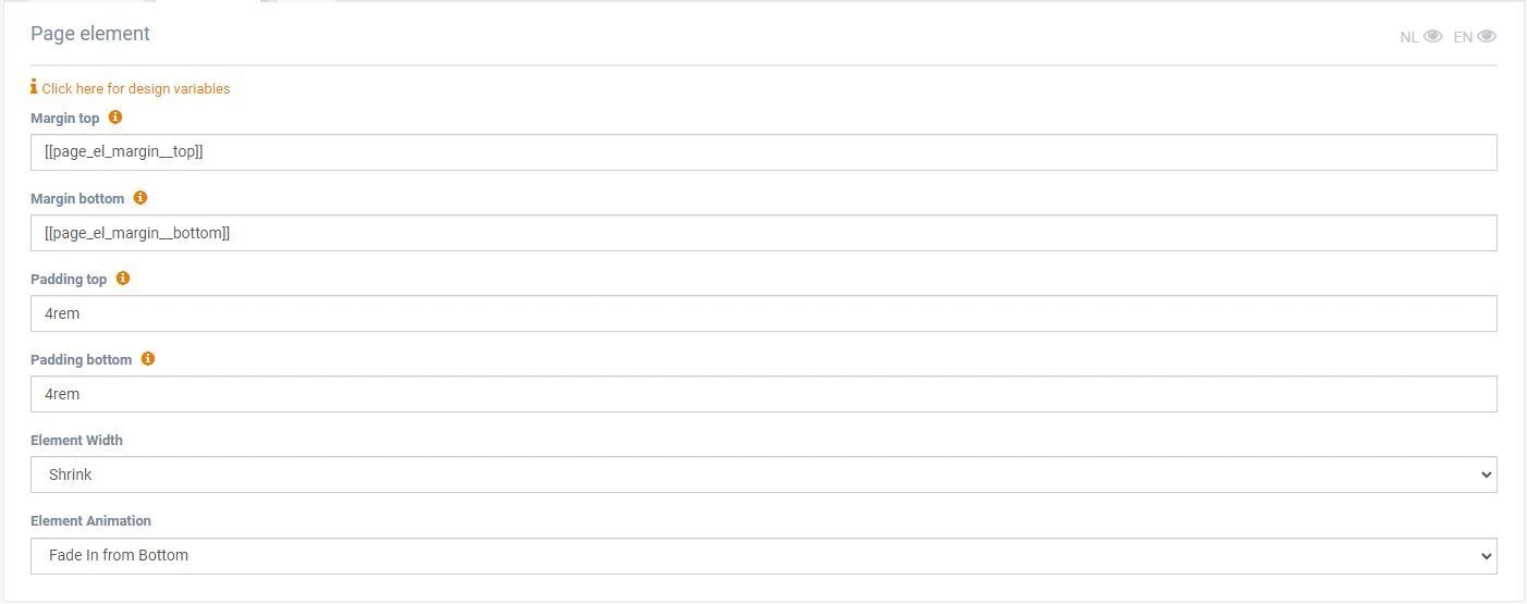
Padding controls the space within the edges of the page element, which can create a visual effect, such as when using a background color:
Note: This will also enlarge the gray background of the page element.
Margin controls the distance between two page elements. In the example below, the margin is set to 0 (rem), causing one element to flow directly into the black background of the following element. With margin in between, the underlying background color of the page becomes visible.
The width setting determines how wide the page element is. There are four options:
- Shrink – makes the element smaller
- In column – fits within the column width
- Expand – makes it slightly larger
- Full width – fills the entire page width
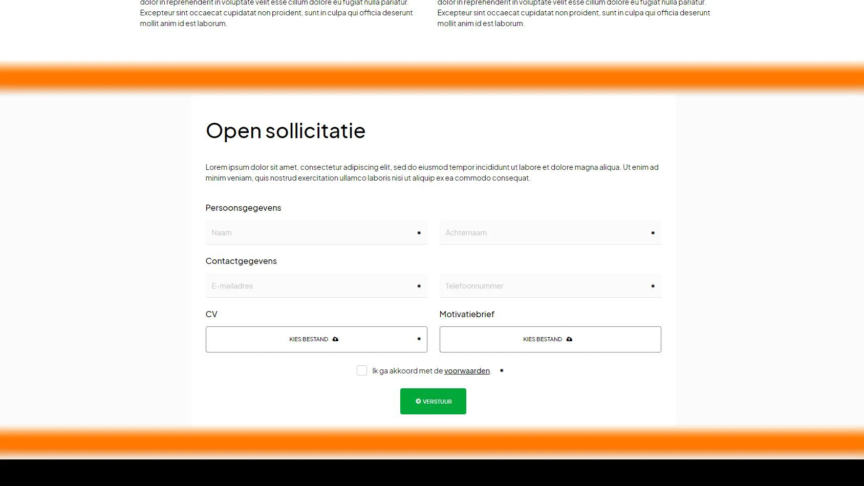
Example of a page element set to 'shrink':
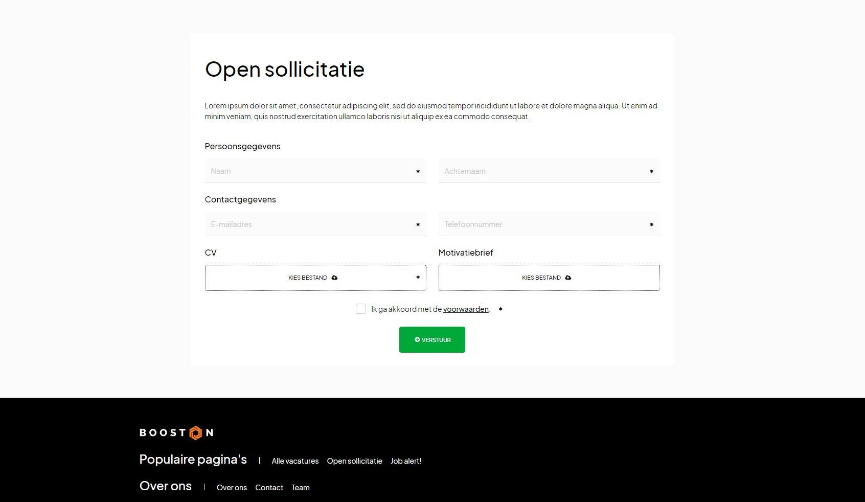
Example of the same page element set to 'expand':
Finally, you can set animations using the 'element animation' option. Experiment with this to make your website more dynamic.
Setting up a page element: settings tab
Advanced users can find additional options here. For beginners, this tab is often not needed. Here you will find, among other things, a scheduling option to make a page element visible only from a specific date and time.
Another option is the 'widget data' section.
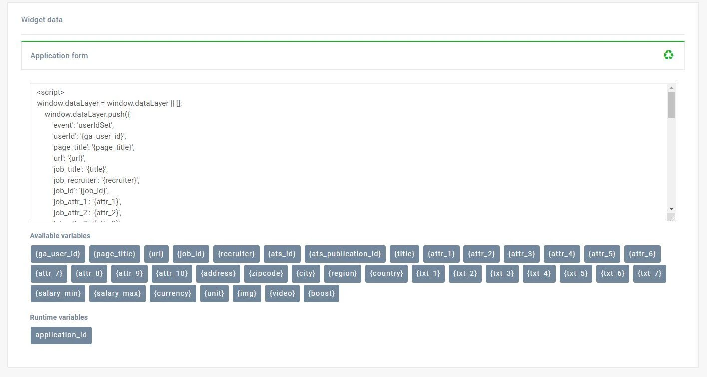
With widget data, you can activate data layers when a follow-up action (see content tab) is performed. For example, with an application form, data layers can be activated for Google Analytics, Tag Manager, or other applications. More on this in the article about Marketing & Data.
Managing page elements
Now that we have created a page element (new or copied) and set it up with content, design, and settings, we can review what we have built.
Go to all your page elements via:
Content > Page Elements
Note: Each page element has a title, which consists of the name of the template and a unique description that you provide.
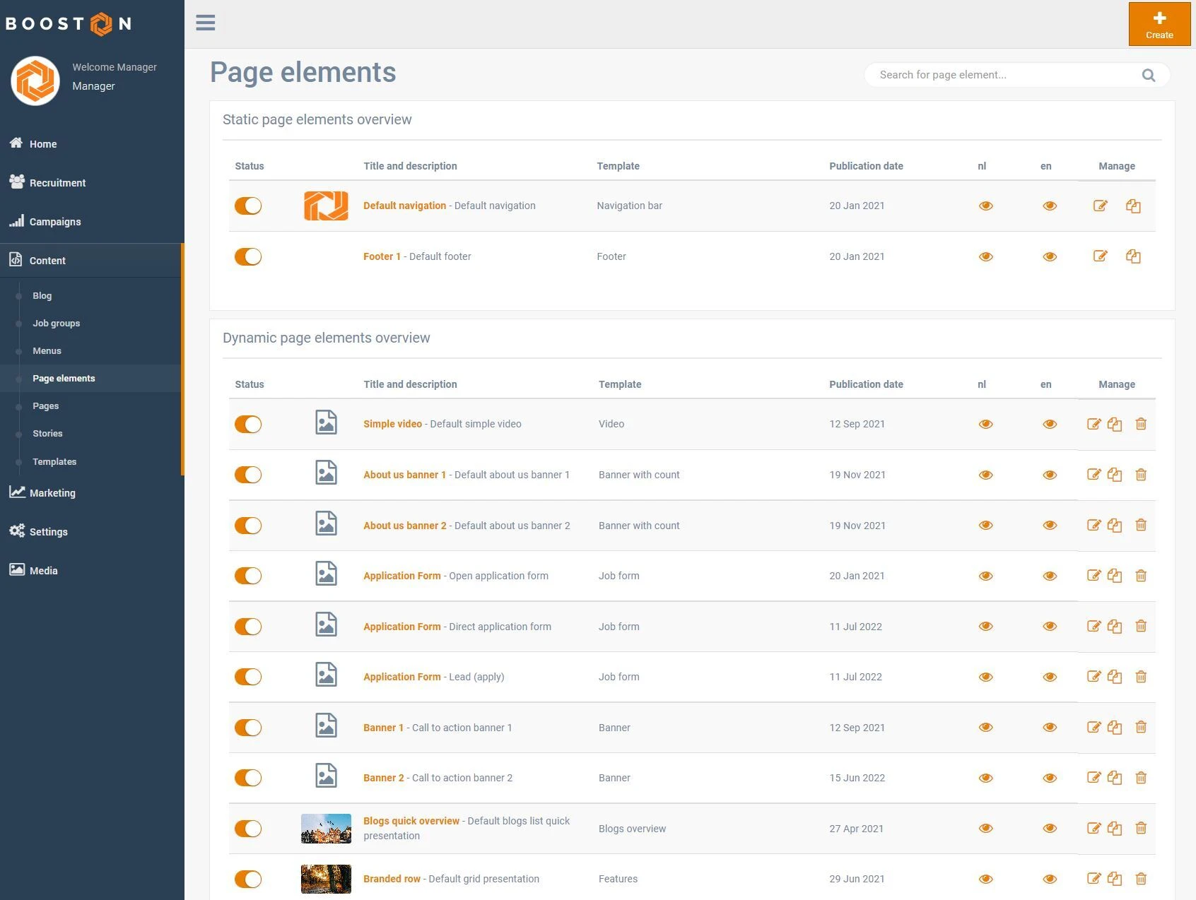
For each language, an 'eye' icon is visible, allowing you to quickly preview it. The edit button allows you to adjust the content, design, and settings. The copy icon duplicates an element, and the trash icon deletes it completely.
Note: A page element that is in use cannot be deleted. You will receive a notification indicating on which pages it is used, and you must remove it from those pages first.
Conclusion
Now that you are ready to use page elements, you can apply them to your pages. Be sure to read the article on pages for more information on managing pages in the Booston platform.


