Pagina-elementen zijn de bouwstenen van uw pagina. U moet ze aan uw pagina toevoegen en de inhoud erin beheren om uw website of kandidaattrajecten voor uw campagnes te creëren. Op deze pagina hebben we 3 verschillende pagina-elementen uitgelicht die samen het grotere verhaal vormen:
De gebruikte pagina-elementen in volgorde van verschijning:
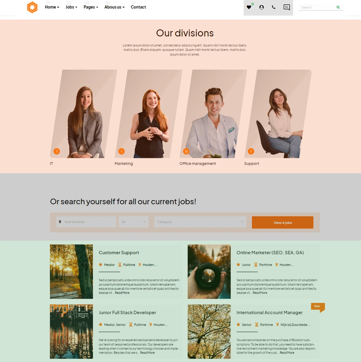
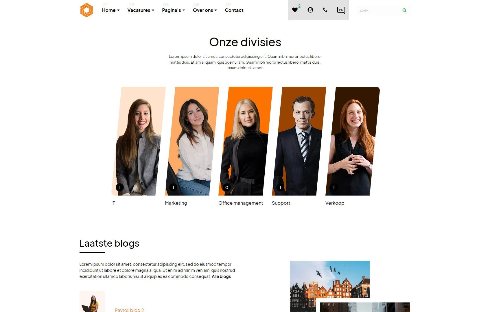
- Categorie-overzicht 1 pagina-element (gemarkeerd in oranje)
- Eenvoudig zoekformulier voor vacatures (gemarkeerd in grijs)
- Vacaturelijst pagina-element (gemarkeerd in groen)
In dit artikel laten we zien hoe u deze pagina-elementen maakt, vormgeeft naar wens en beheert zodat u uw pagina's kunt opzetten.
Inhoud
- Pagina-element aanmaken
- Pagina-element instellen: inhoudstabblad
- Pagina-element instellen: ontwerptabblad
- Pagina-element instellen: instellingstabblad
- Pagina-elementen beheren
- Conclusie
Pagina-element instellen: inhoudstabblad
Elk pagina-element bestaat uit 3 tabbladen: een inhoudstabblad, een ontwerptabblad en een instellingstabblad.
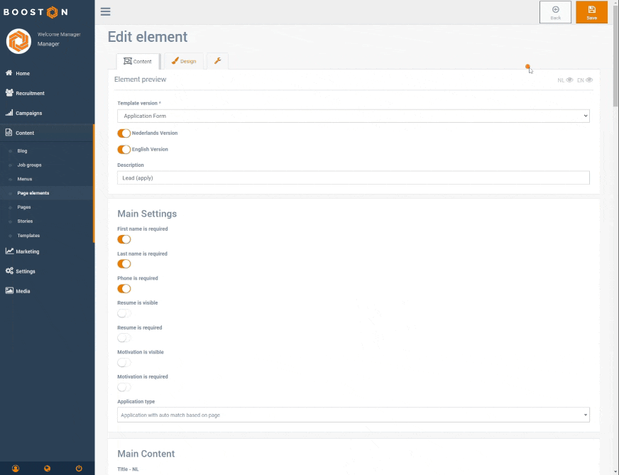
Het inhoudstabblad kan uit de volgende secties bestaan: De eerste sectie bevat de algemene instellingen van het pagina-element zoals het gebruikte template, de talen en de naam (beschrijving) van het pagina-element. Let op dat deze sectie ook een 'oog'-icoon per taal bevat waarmee u een voorbeeld kunt bekijken:
De volgende secties zijn optioneel, wat betekent dat niet elk pagina-element ze gebruikt.
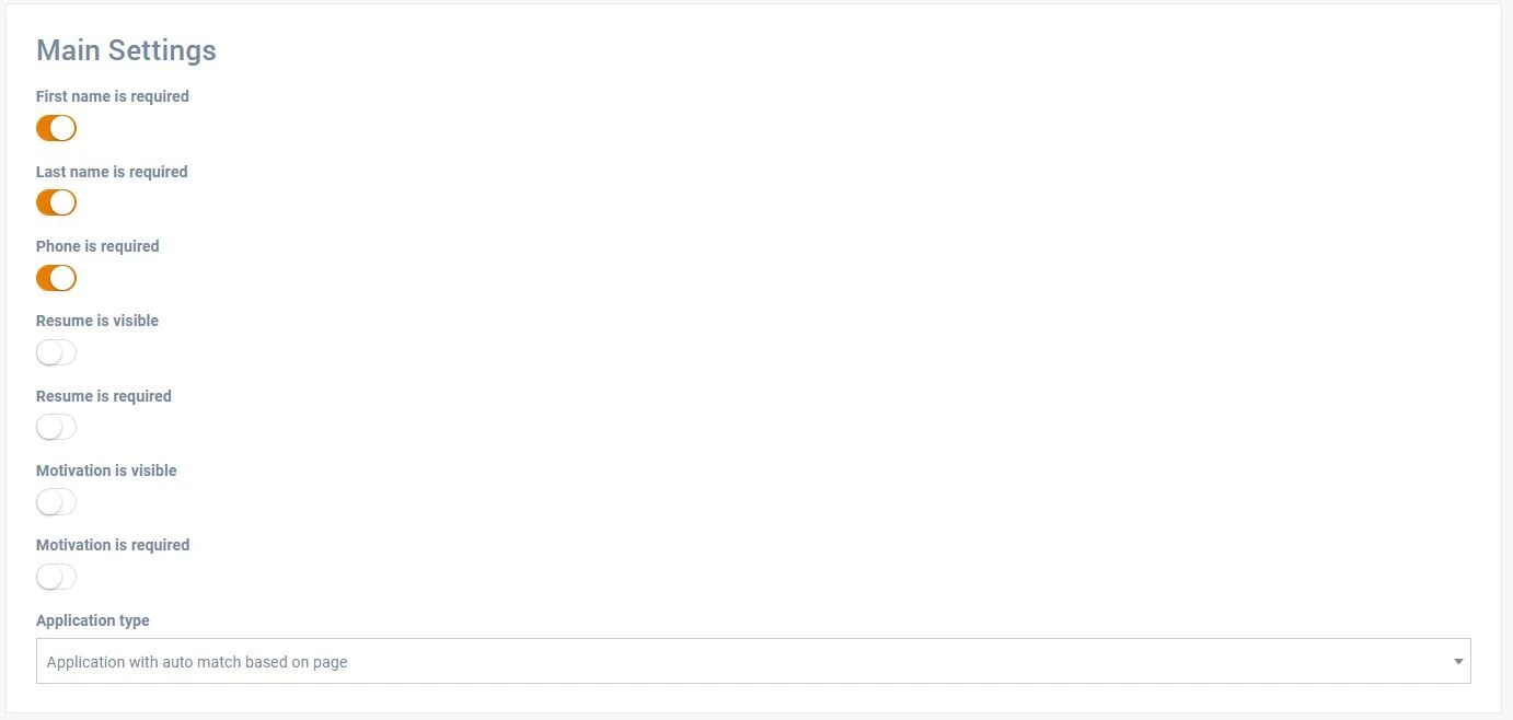
De eerste optionele sectie is 'Algemene instellingen'. Deze wordt gebruikt om de algemene instellingen van uw pagina-element te configureren. In dit voorbeeld betreft het een sollicitatieformulier. Hier kunt u bijvoorbeeld instellen aan welke vacature het formulier gekoppeld moet worden. Deze instellingen gelden voor alle talen.
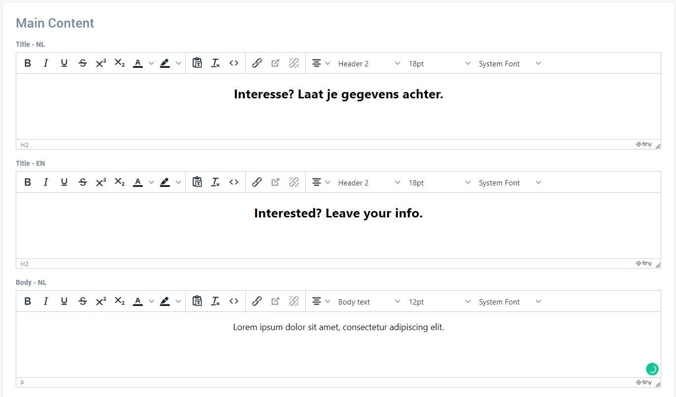
De tweede optionele sectie is 'Hoofdinhoud'. Deze loopt uiteen van afbeeldingen tot teksteditors waarmee u aangepaste inhoud toevoegt. De inhoud in deze sectie is per taal instelbaar.
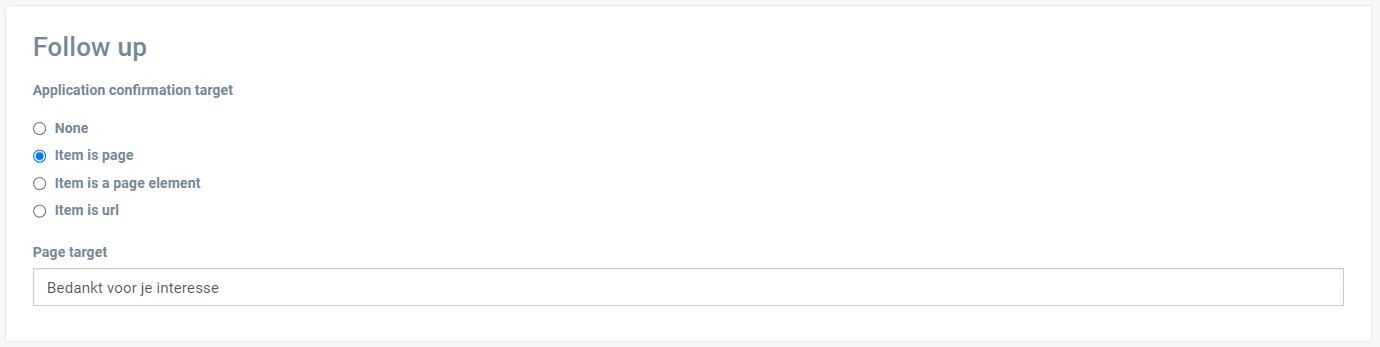
De derde sectie is 'Opvolging'. Hier stelt u vervolgacties in zoals doorklikken naar een andere pagina, een ander pagina-element of een aangepaste URL (bijv. een externe website).
Tot slot tonen de secties 'Gebruik van element' en 'Gebruik met aangepaste inhoud' op welke pagina’s dit element wordt gebruikt. Meer hierover in het artikel over pagina's maken.
Pagina-element instellen: ontwerptabblad
Het ontwerptabblad beheert de visuele presentatie van het pagina-element, exclusief de inhoud die via het inhoudstabblad is ingesteld.
Het ontwerptabblad bestaat uit 2 secties: de algemene ontwerpinstellingen van het pagina-element en de ontwerpinhoud.
De instellingen in de algemene sectie zijn voor elk pagina-element gelijk. We bespreken de eigenschappen hieronder in detail.
De eerste instellingen betreffen marges en opvullingen (paddings) van het pagina-element.
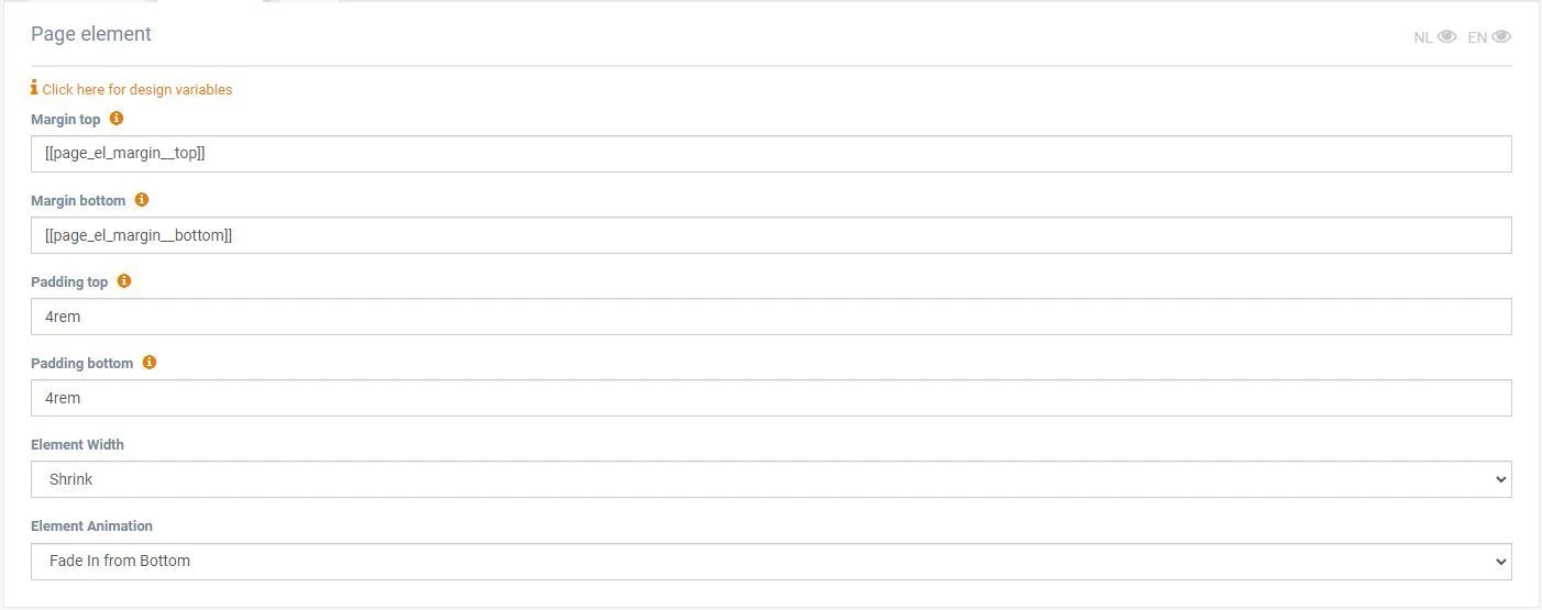
Padding regelt de ruimte binnen de randen van het pagina-element, wat visueel effect kan geven bij bijvoorbeeld een achtergrondkleur:
Let op: de grijze achtergrond van het pagina-element wordt hierdoor ook vergroot.
Margin regelt de afstand tussen twee pagina-elementen. In onderstaand voorbeeld is de marge ingesteld op 0 (rem), waardoor het ene element direct overgaat in de zwarte achtergrond van het opvolgende element. Met marge ertussen wordt de onderliggende achtergrondkleur van de pagina zichtbaar.
De breedte-instelling bepaalt hoe breed het pagina-element is. Er zijn vier opties:
- Verkleinen – maakt het element kleiner
- In kolom – past het in de kolombreedte
- Uitbreiden – maakt het iets groter
- Volledige breedte – vult de volledige paginabreedte
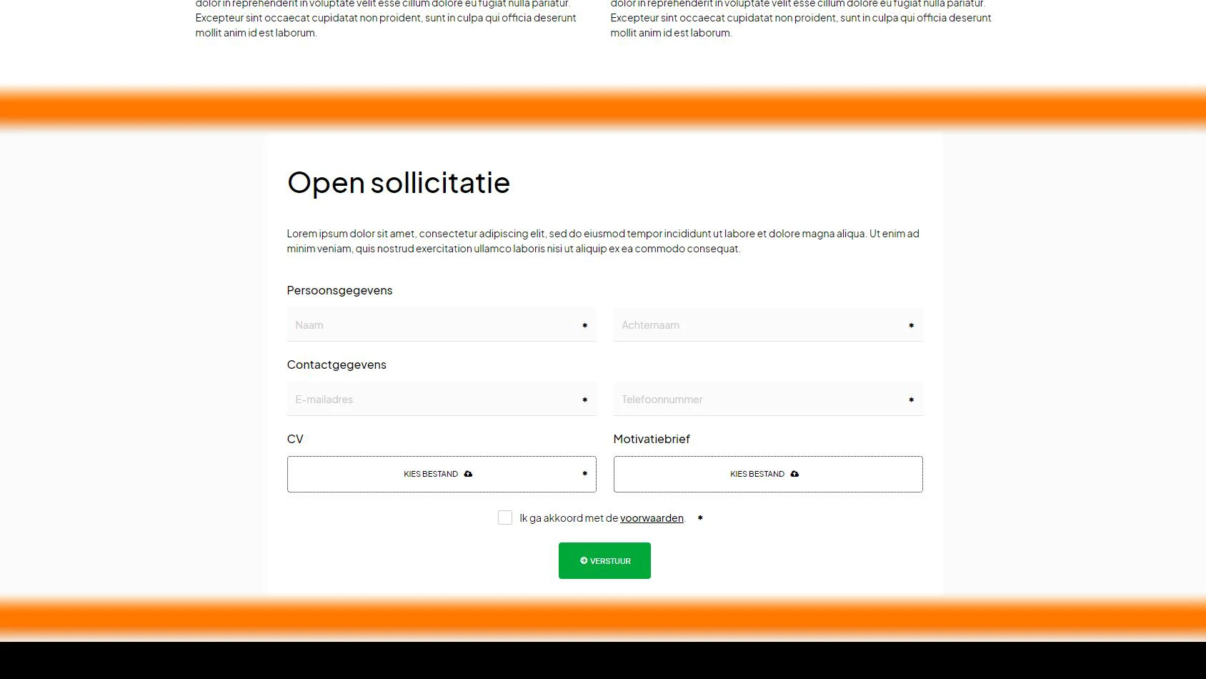
Voorbeeld van een pagina-element dat is ingesteld op 'verkleinen':
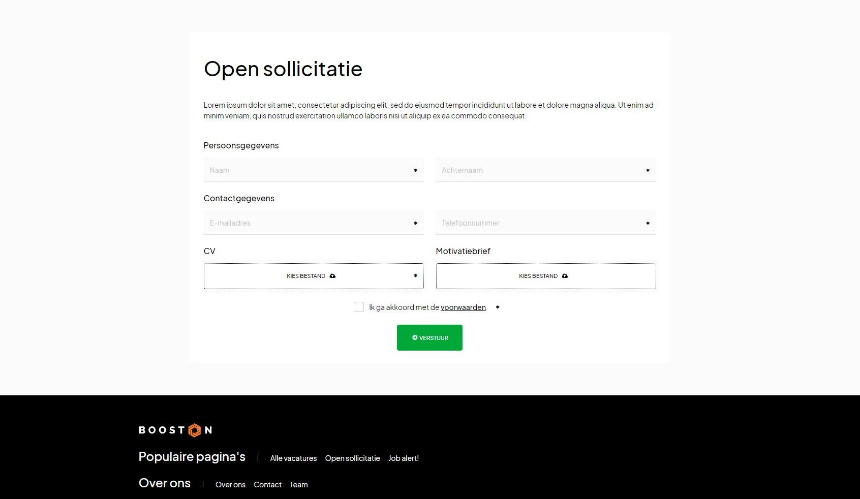
Voorbeeld van hetzelfde pagina-element ingesteld op 'uitbreiden':
Tot slot kunt u met de optie 'elementanimatie' animaties instellen. Experimenteer hiermee om uw website dynamischer te maken.
Pagina-element instellen: instellingstabblad
Geavanceerde gebruikers kunnen hier extra opties vinden. Voor beginners is dit tabblad vaak niet nodig. Hier vindt u onder meer een planningsoptie om een pagina-element alleen zichtbaar te maken vanaf een specifieke datum en tijd.
Een andere optie is de sectie 'widgetdata'.
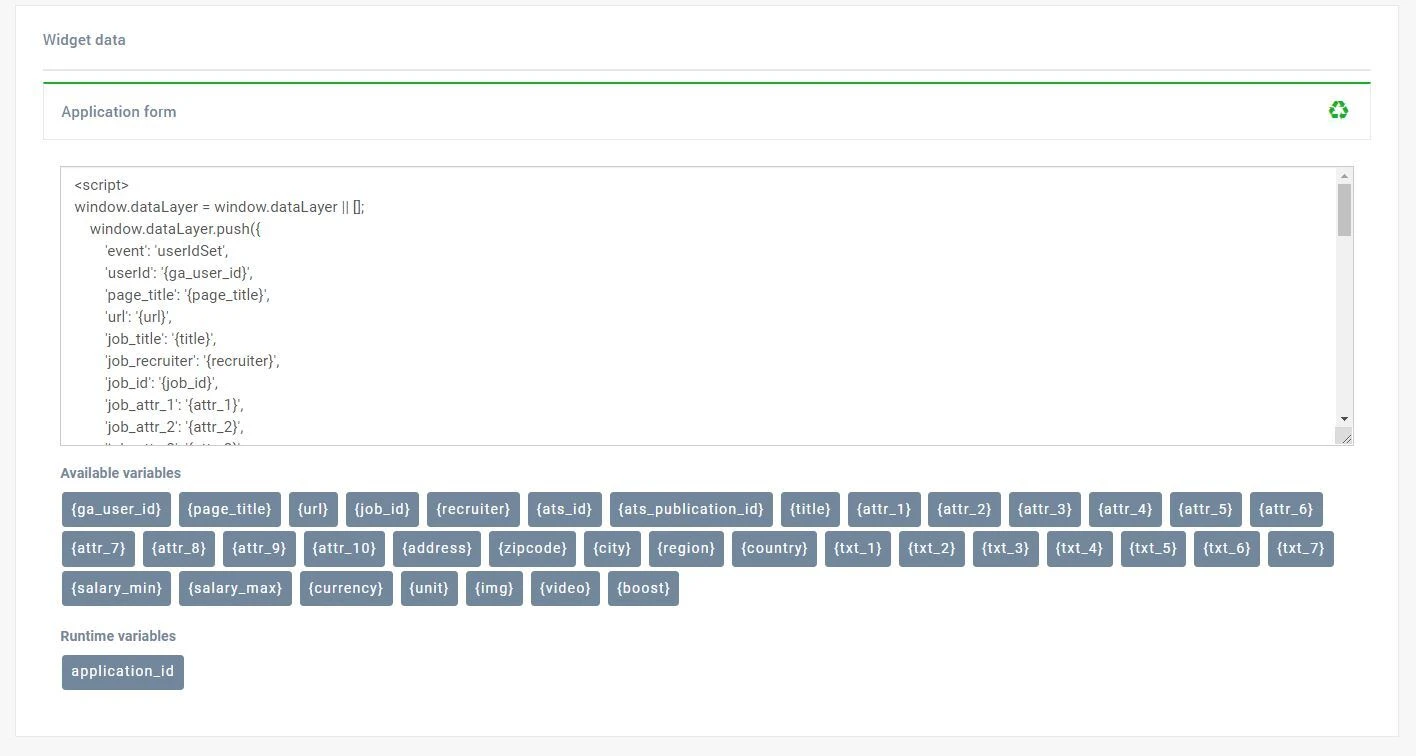
Met widgetdata kunt u datalayers activeren wanneer een vervolgactie (zie inhoudstabblad) wordt uitgevoerd. Bijvoorbeeld: bij een sollicitatieformulier kunnen datalayers worden geactiveerd voor Google Analytics, Tag Manager of andere applicaties. Meer hierover in het artikel over Marketing & Data.
Pagina-elementen beheren
Nu we een pagina-element hebben aangemaakt (nieuw of gekopieerd), en dit hebben ingesteld met inhoud, ontwerp en instellingen, kunnen we bekijken wat we hebben opgebouwd.
Ga naar al uw pagina-elementen via:
Inhoud > pagina-elementen
Let op: elk pagina-element heeft een titel die bestaat uit de naam van het template en een unieke beschrijving die u zelf geeft.
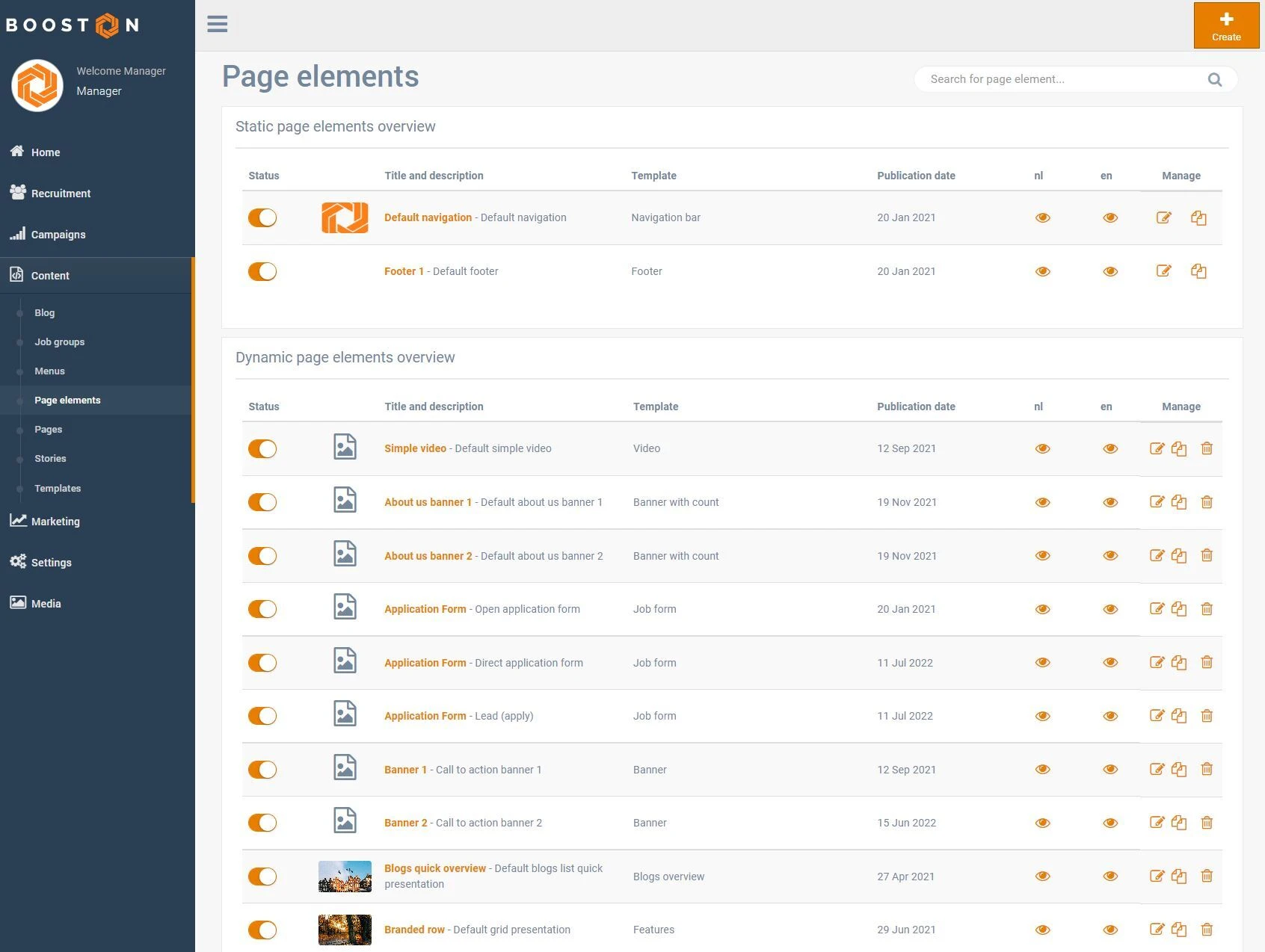
Per taal is er een oog-icoon zichtbaar waarmee u snel een voorbeeld kunt bekijken. Met de bewerkknop kunt u inhoud, ontwerp en instellingen aanpassen. Met het kopieericoon kopieert u een element, en met het prullenbakicoon verwijdert u het volledig. Let op: een pagina-element dat in gebruik is, kan niet worden verwijderd. U krijgt een melding op welke pagina’s het wordt gebruikt en dient het daar eerst te verwijderen.
Conclusie
Nu u klaar bent om pagina-elementen te gebruiken, kunt u ze toepassen op uw pagina’s. Lees zeker het artikel over pagina’s voor meer informatie over het beheren van pagina’s in het Booston-platform.


